Nutrii, formerly known as Nova Nutrii, was undergoing a significant transformation to reflect simplicity, clarity, and modernity in its brand. Having worked with Nutrii for many years, we were tasked with their first rebranding to evolve their visual and verbal identity for a more dynamic digital future. The challenge was to simplify the brand while maintaining its well-established trust and reliability, ensuring a seamless transition for existing customers while attracting new ones.
Nutrii
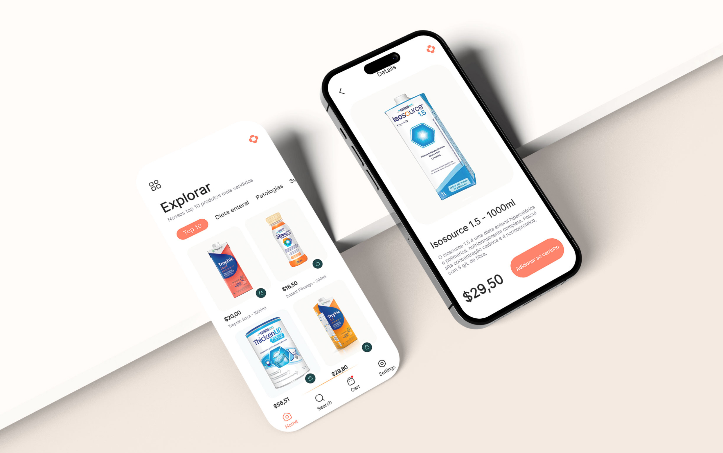
Nutrii transformed its brand to embrace a digital-focused identity.
simplifying nutrition for a modern world.
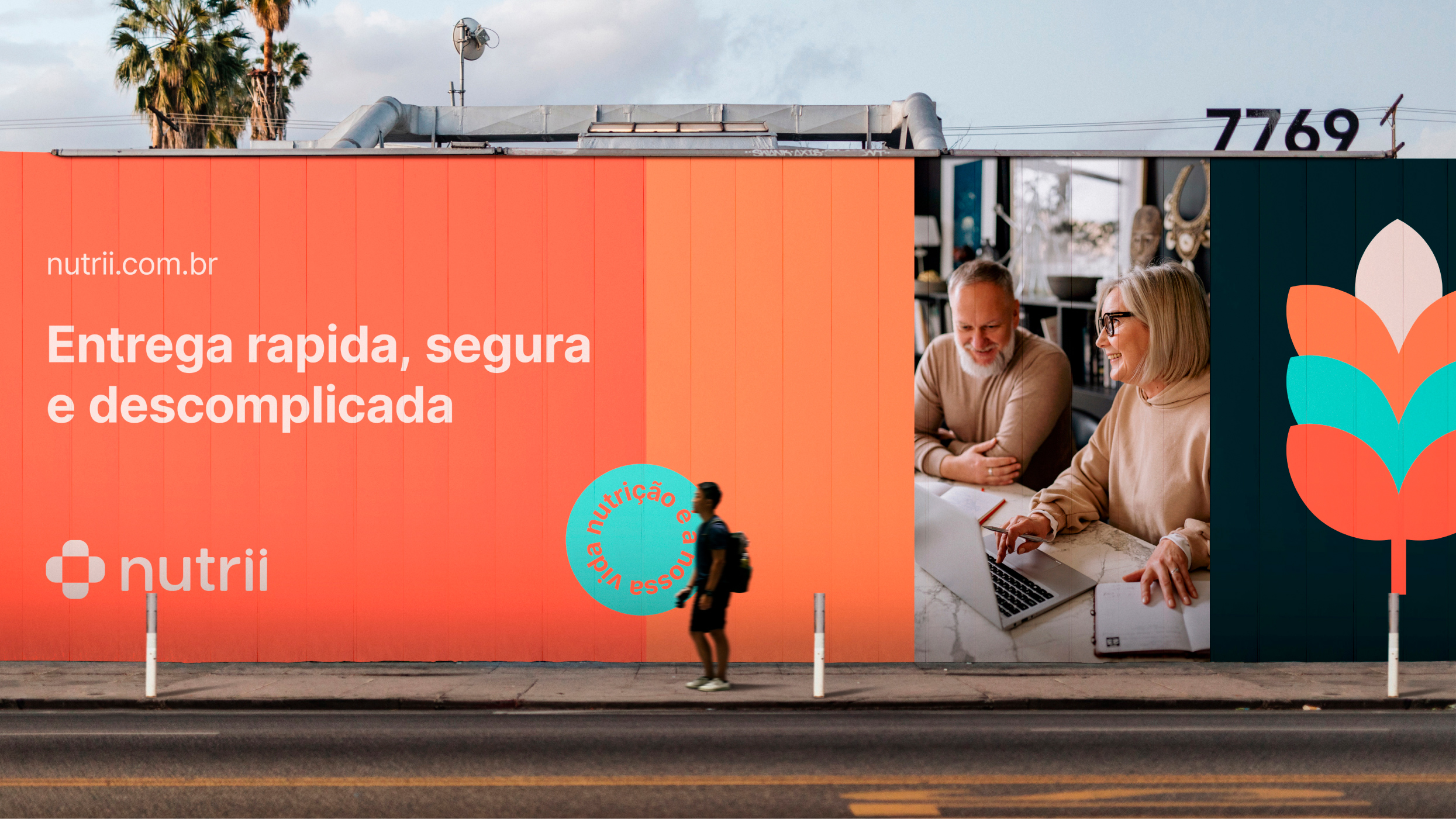
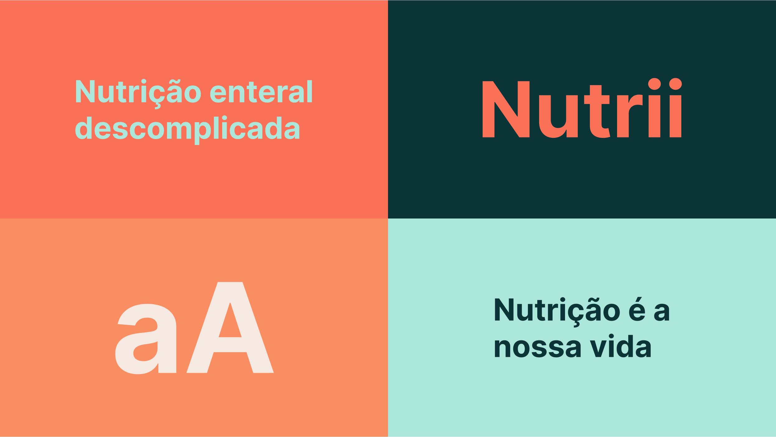
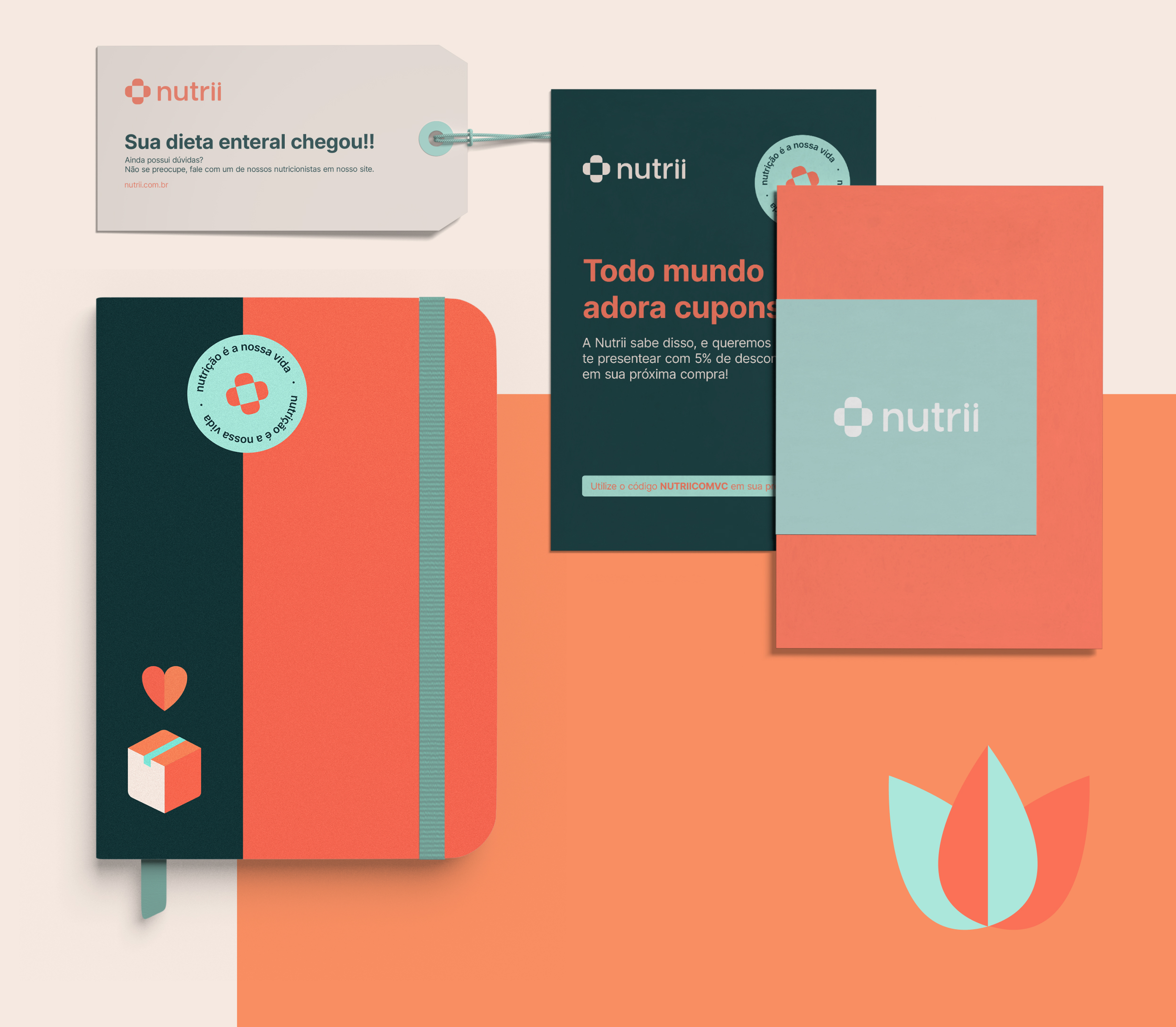
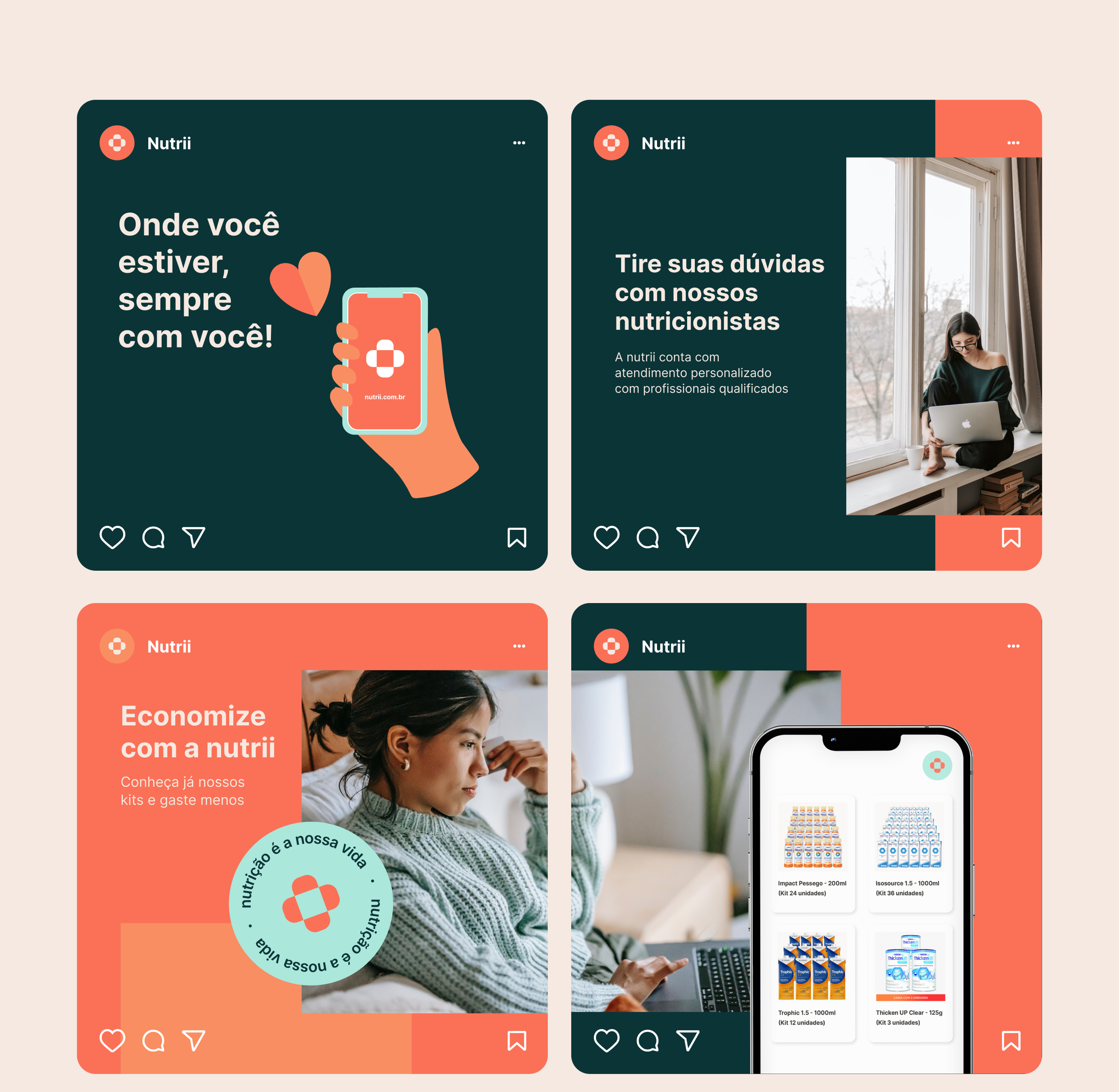
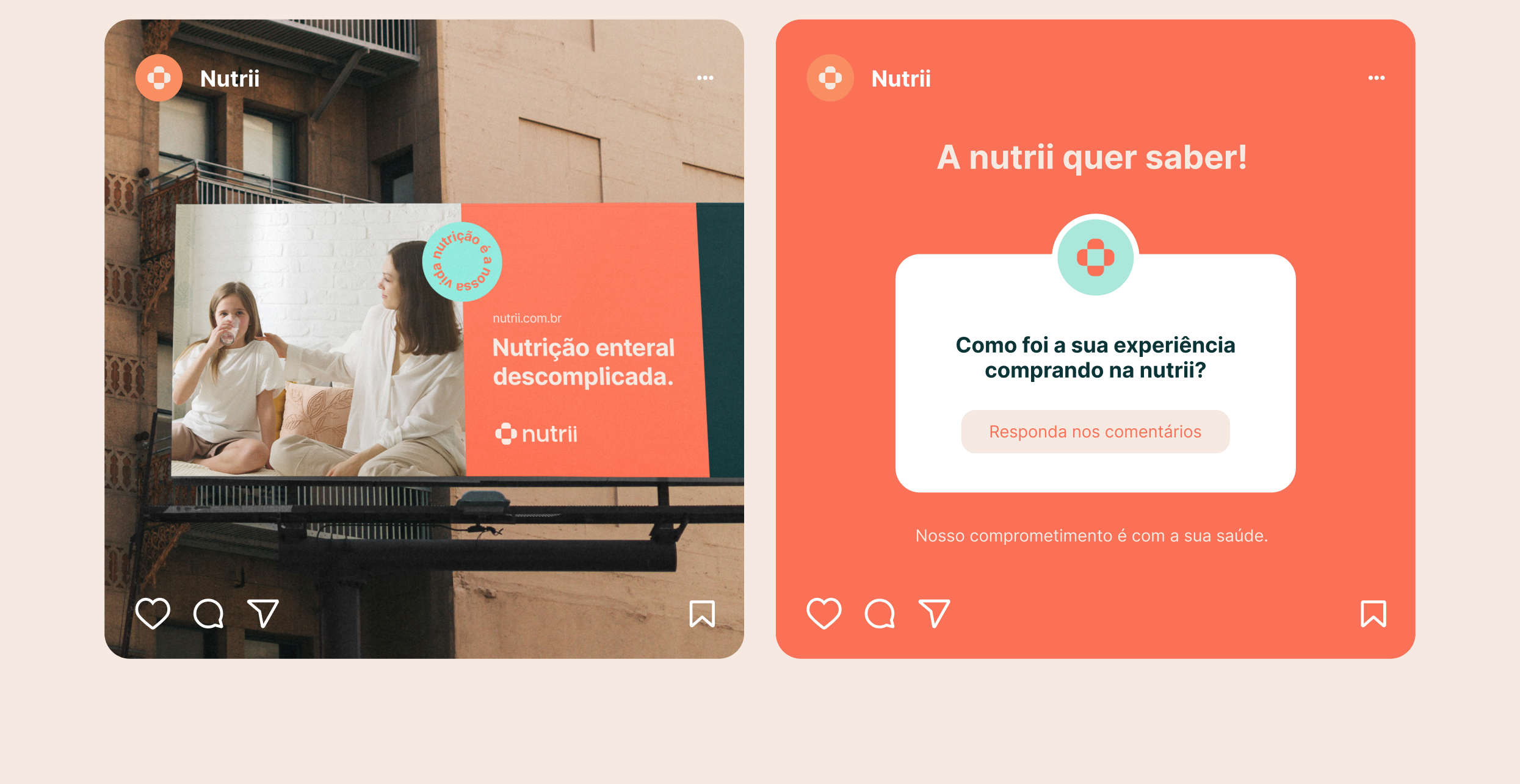
We delivered a comprehensive rebranding solution for Nutrii that emphasized clarity and modernity. We transitioned the brand name from “Nova Nutrii” to simply “Nutrii,” reflecting its commitment to simplicity and dynamism. The visual identity retained Nutrii’s signature orange, associated with trust, while expanding the color palette for a more modern feel. This combination ensured the brand remained recognizable while appealing to a digital-savvy audience.
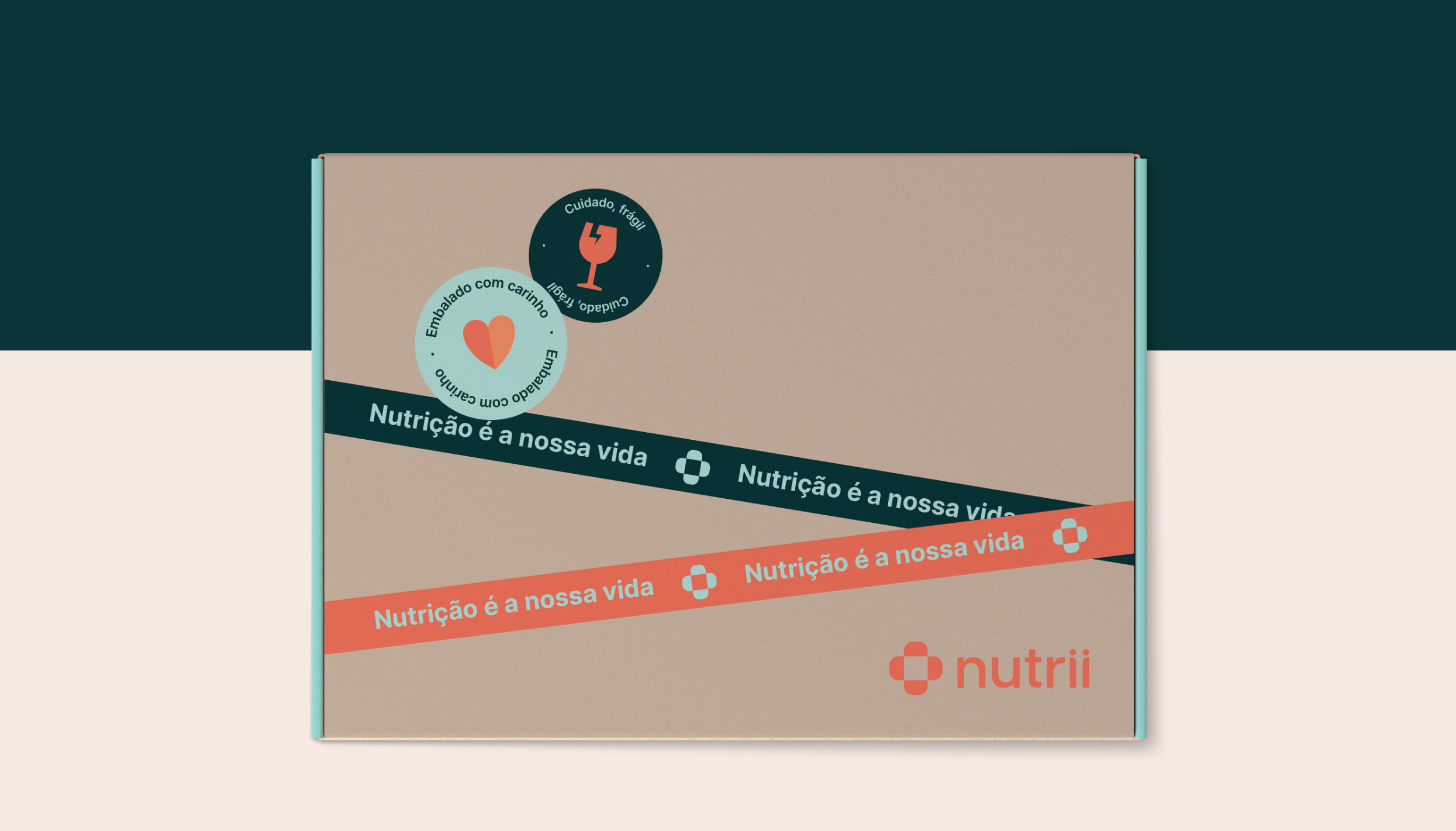
A new brand symbol representing a box opening was designed to convey the ease and speed of Nutrii’s enteral diet delivery. This symbol enhances engagement across digital platforms when animated, embodying the idea that “your diet has arrived.” We selected the Inter font for optimal readability on screens, reinforcing Nutrii’s digital presence. Additionally, a new set of illustrations was created to make the brand more approachable, highlighting themes like “enteral diets made easy” and “nutrition is our life.” These visual elements explain Nutrii’s services in an informative and engaging way.



great stuff right, we can do it for you
Barcelona · Spain | São Paulo · Brazil